Roles: UX Designer, Researcher, Illustrator
Responsibilities: User Research, Wireframes, Prototype Designs, Illustration, Logo Design, Mockups
The problem:
I wanted this app to allow users to place orders with ease and the ability to customize their orders like they would in person. I also wanted to include saved preferences to user’s profiles to filter out any ingredients they cannot consume to prevent any accidents or mistakes in their orders.
The Goal
The goal of this project was to test the prototype on users with and without dietary restrictions/preferences, ages 18-65, familiar and unfamiliar with mobile apps, and receive honest feedback of the product’s usability and transparency using surveys.
User Pain Points
Hidden Charges
Multiple users expressed frustration with hidden fees and charges placed at the checkout when ordering a meal on a mobile app.
Lack of Customization
A couple users explained their dietary restrictions and concerns with apps that disregard this need and sometimes cannot provide customization or can make a mistake in their order.
Pictures of Dishes
Most users found they are more likely to order a dish if a photo is available so they can know what to expect if they've never dined at that restaurant before.
Miscommunication
Most participants relayed an experience of their order being wrong due to miscommunication between the restaurant and the customer.
I expected most participants to be well versed in mobile apps and not have many issues with the present apps available but found that there were many pain points that I hadn’t considered before conducting the user research.
Persona
Mark 24
Mark is a local beekeeper who needs flexible customization on mobile ordering apps because of his and his partner’s allergies and dietary restrictions.
"I love trying out new foods with my partner without breaking the bank!"
Goals
- Access to diverse food menus that accommodate their diet
- Spend quality time with their family
Frustrations
- Customizations are often unavailable
- Incorrect orders
- Hidden fees mislead order total assumptions
Wireframes
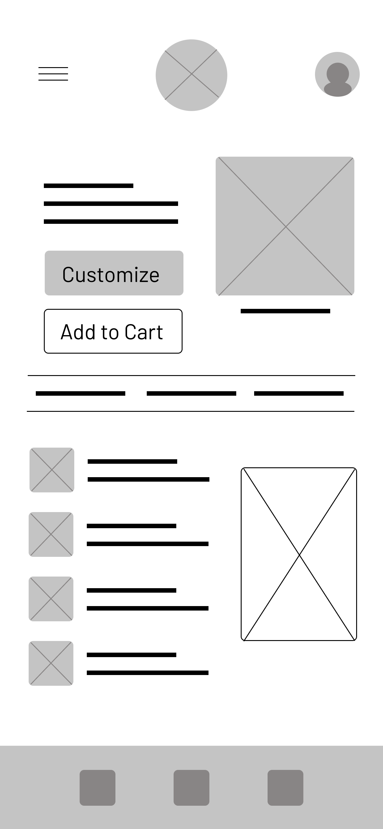
I started creating paper wireframes for the mobile app while keeping in mind details users had concerns over and how to maintain transparency regarding ingredients, customization, and fees.
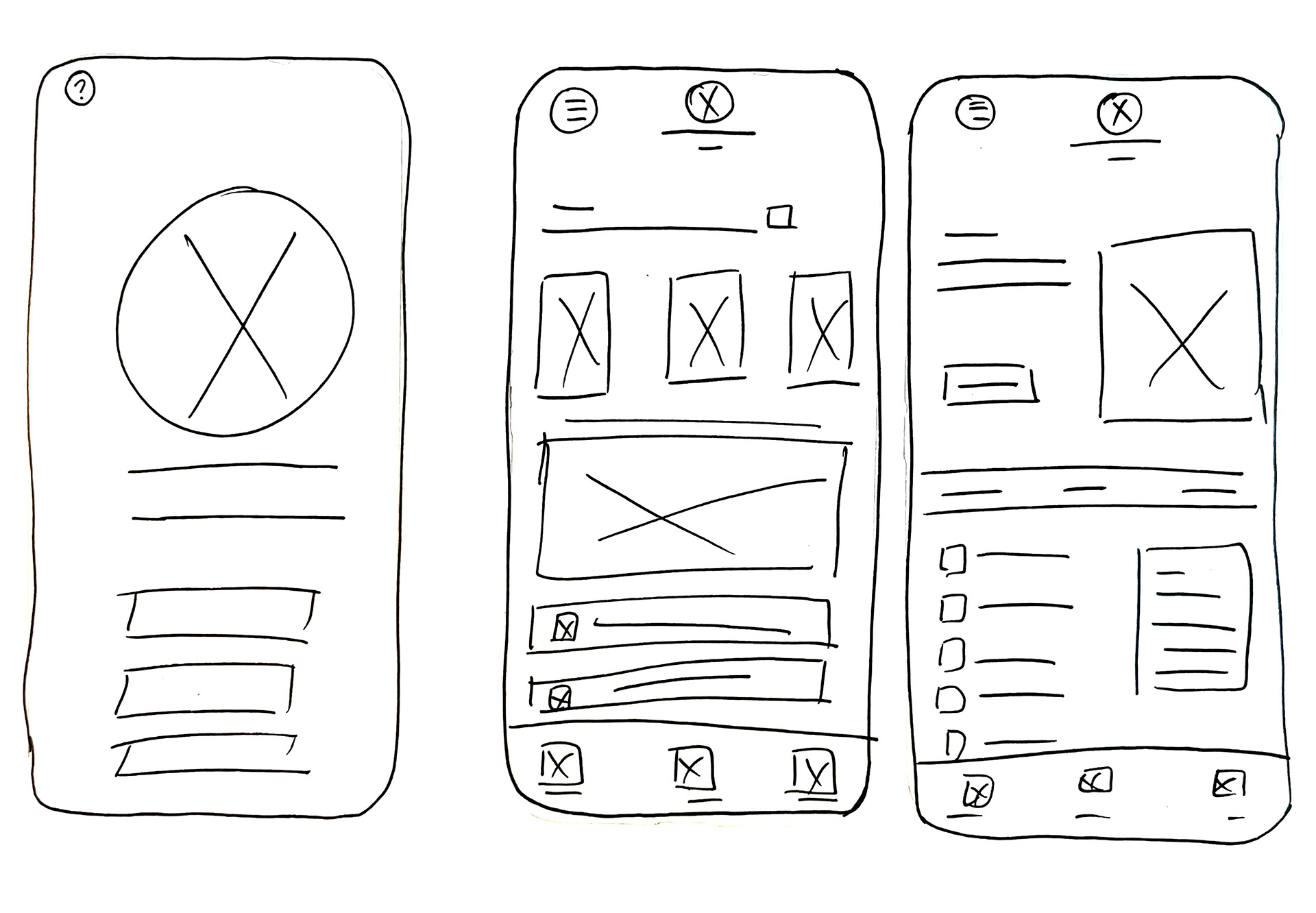
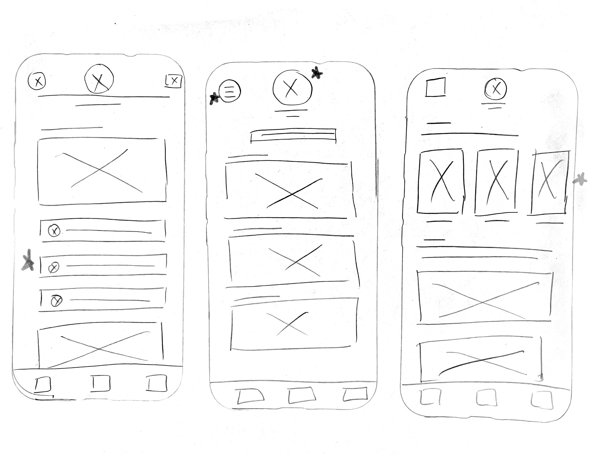
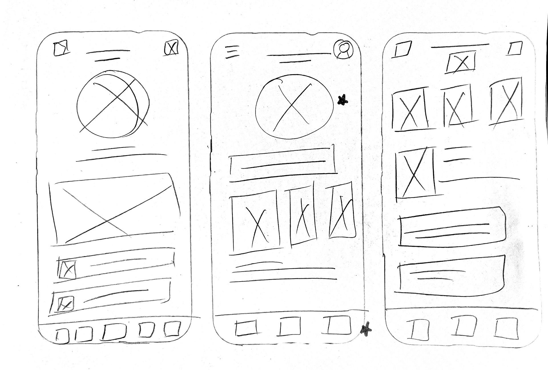
Once the hand drawn designs were finalized, I used Figma to create digital wireframes with the key points that translated best from the paper wireframes. I took inspiration from other successful mobile ordering apps while incorporating user needs that weren't available on most.
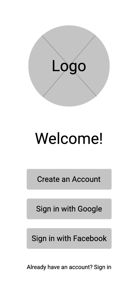
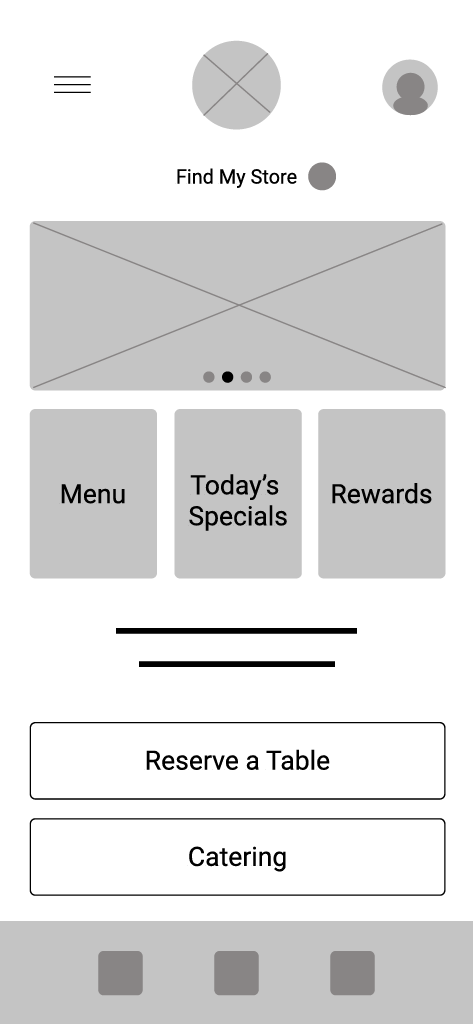
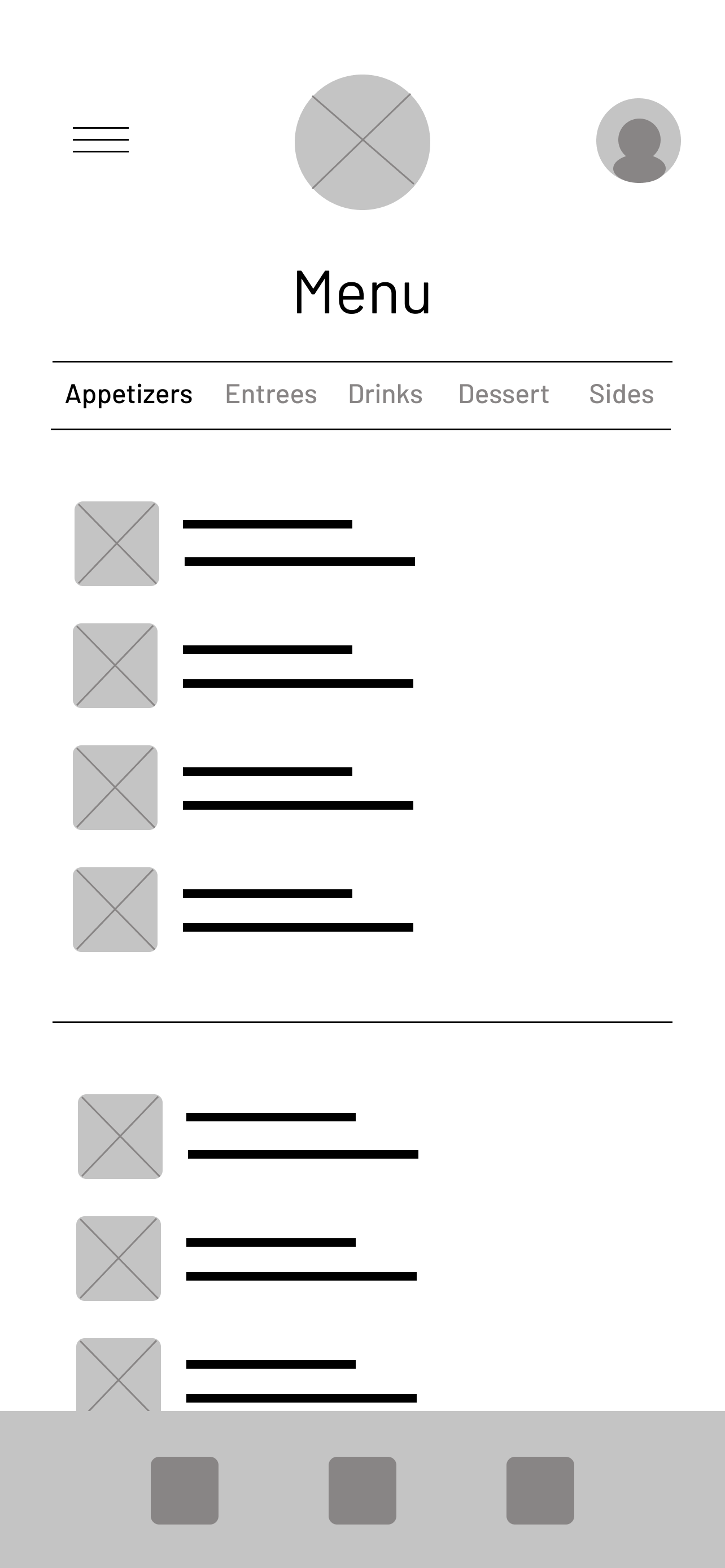
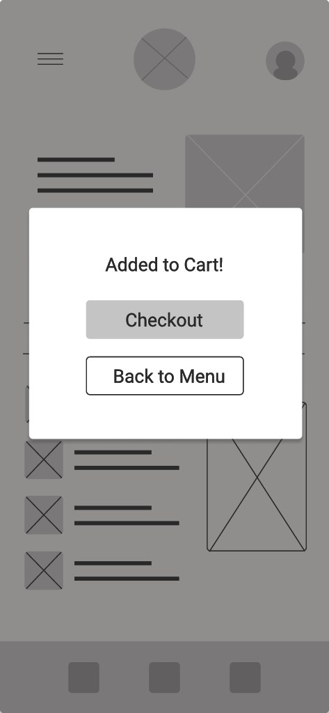
Since customization was the user's biggest pain point, I wanted every dish to have the option to be customized and have a variety of substitutions, not just for entree's but for side dishes as well.
This low fidelity prototype shows the basic functions and actions of the app, the link to this prototype can be found below.
Usability Studies
I conducted two rounds of unmoderated usability studies, a survey and questionnaire with tasks to complete. The first round used the low-fidelity prototype and helped refine the designs. The second was used with the high-fidelity mockups to understand what needed to be refined in the mockups
Round 1 Findings
- Users want customization options
- No hidden fees, questioned the need for some fees
- Clear communication between restaurant and user
Round 2 Findings
- Saved customization preferances were hard to find
- Navigation had some glitches
- Colors made some buttons hard to read
Mockups
The usability study made it clear that the customization option should be highlighted as it was a unique feature of this app. I added the “Customize” button directly under a dish and used the brand colors to highlight the option along with the "Add to Cart" button.
First digital mockup
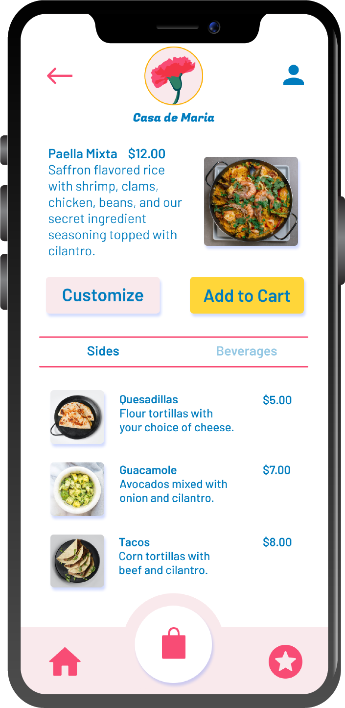
I created the brand for the app based on Spain's national flower and chose colors that reflected the vibrant culture that also enticed the appetite when paired with the traditional Spanish dishes. For the logo, I illustrated a simple red carnation design and used a stylistic bold font font the name and simple sans serif font for headers and paragraphs.
I illustrated icons to pair with each protein option for the high fidelity mockup and used a simple style that resonated with the restaurant's theme and brand.
Since this was a Spanish cuisine restaurant, I searched for protein often found in spanish dishes that could be substituted for traditional ingredients and still work with the other ingredients.
This high fidelity prototype shows the actions and functions of the mobile app in more depth.
Accessibility Considerations
-I used simple english vocabulary and large fonts for easy reading for all users
I included information on some of the key features, like the account dietary preferences, so that users know what the feature is and how to enable it.
Takeaways
Impact: My designs were received positively by users. The concepts had great impact but did need some more refining on key features for better user experience.
I learned that designs are always changing and a work in progress. What I thought would be a good solution to a problem users face only opens up more doors for possibilities and advancements in design.
Next Steps
I’d like to integrate a sum calculator at the bottom of the app to keep track of the order’s amount including the fees added for full transparency for the user.
I want to add a feature that allows the app to be translated to different languages. This app is based on a hypothetical Spanish restaurant in the U.S. and many languages are spoken in various locations throughout.
