Mainland icon with the "M" from their logo
This was a concept project for Mainland, the goal was to attract viewers to their marketing services and use icons and text from their website. I kept the color palate of their brand colors and added a light lavender color to compliment the red and smooth out the contrast between the two bright brand colors.
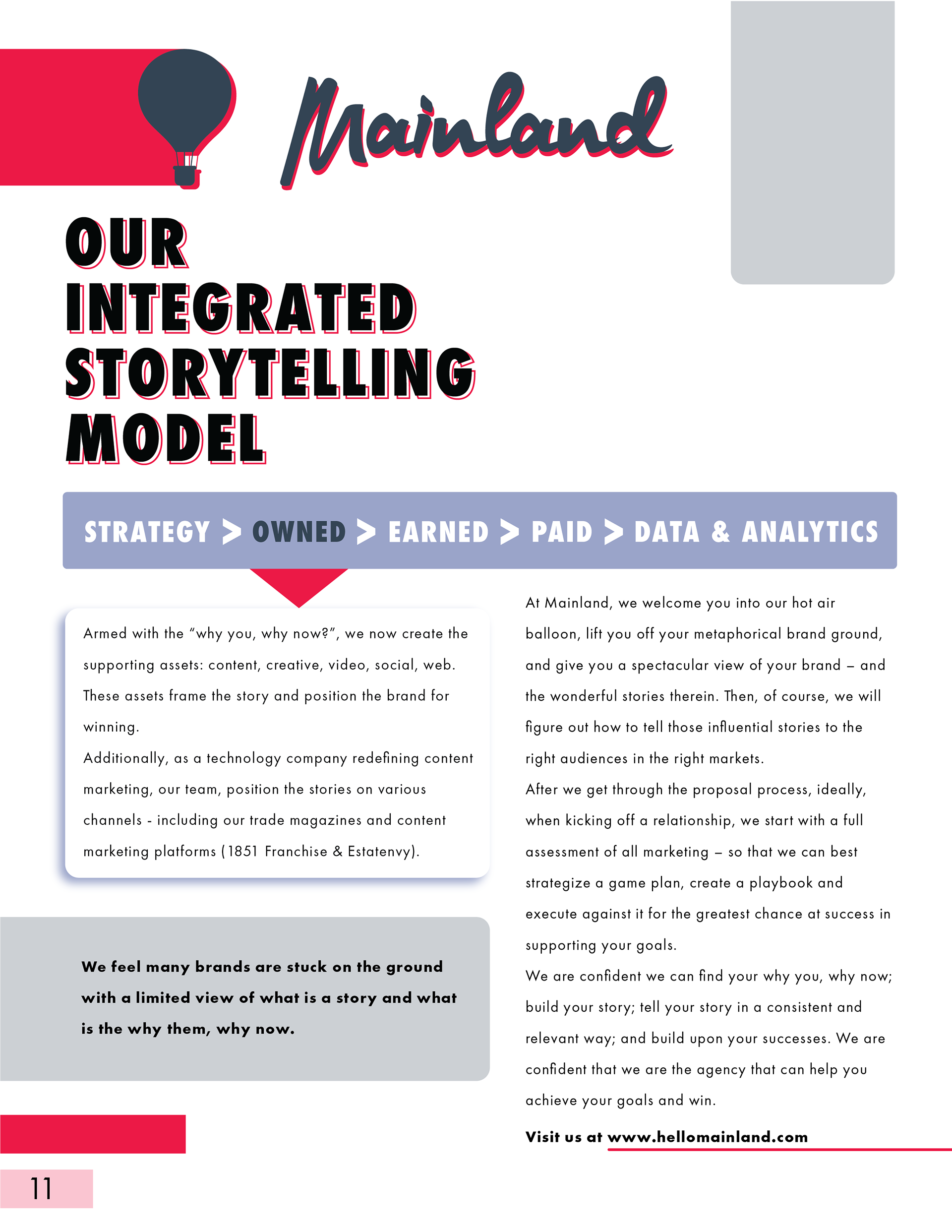
Ad Page 1
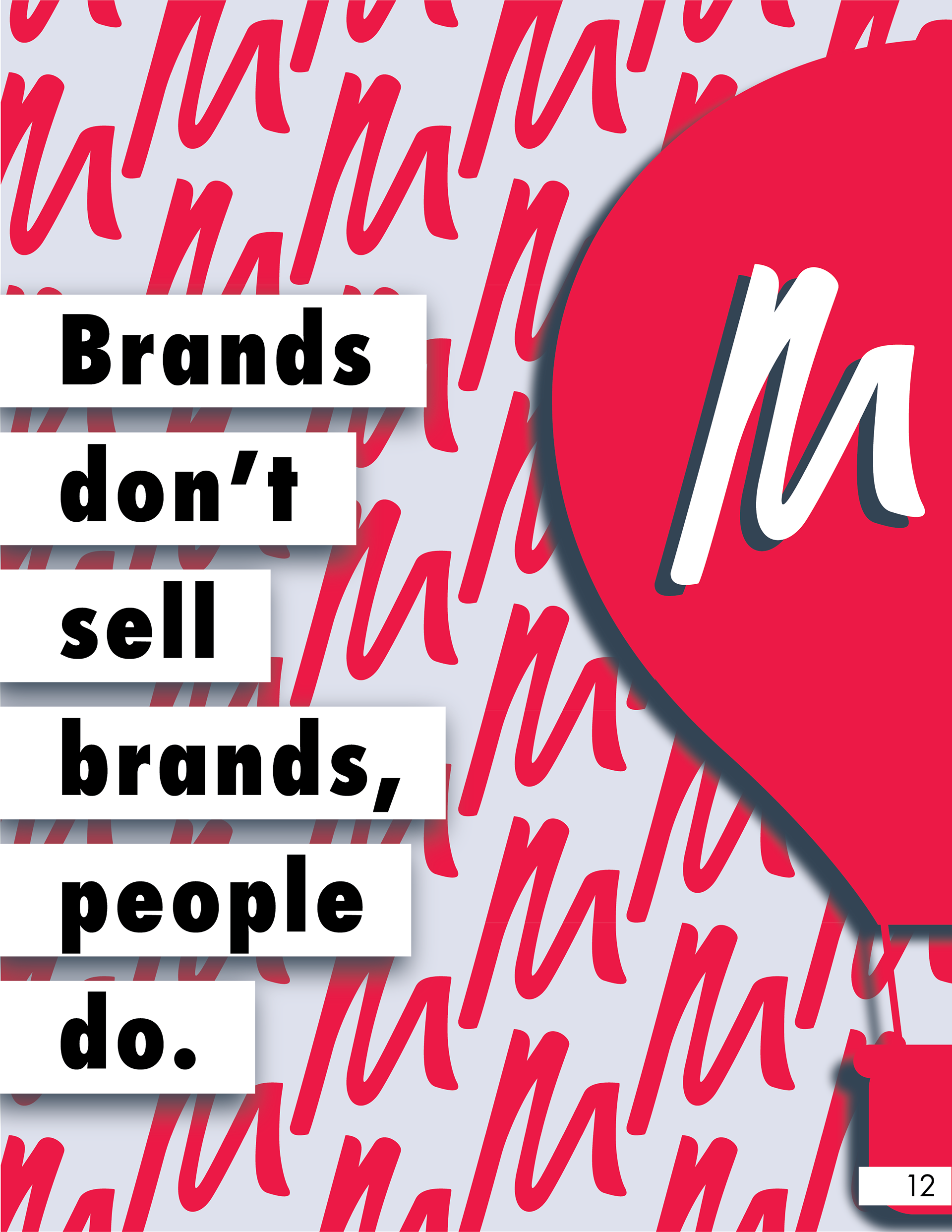
Ad Page 2
I used a section from their website that focuses on step two, Owned, out of the five steps in their model for brand storytelling. It is the step that introduces marketing and content creation so I wanted to highlight that aspect of their model for the goal of the ad. I also wanted to bring light to one of their famous quotes that really stood out to me,
"Brands don't make brands, people do."
M Pattern
I created this background by making a pattern out of the "M" in Mainland's logo and using a lighter shade of the lavender hue I added in the ad. I liked the bold colors of the palate and wanted to compliment them with a more subtle color. The lilac helped make the red "M"s pop while softening their affect on the eyes.
This ad was created for print and I envisioned it as a spread in a magazine and added it onto a mockup to give it a more realistic look into what it would appear as. Since they had such bright colors, I wanted to use them in a way that catches the reader's eye but isn't too loud that it distracts from its purpose.
Print Mockup
Mockup Credit: https://unsplash.com/photos/Sy8dsVyiPgs?utm_source=unsplash&utm_medium=referral&utm_content=creditShareLink
This was the ad digitized and simplified to work on mobile. I focused on using the more colorful design of the two pages as this was meant to be an ad on social media. I thought the quote against the white bars would stand out and catch people's attention and interest them in wanting to learn more about Mainland.
I used the dimensions for the iPhone 13 and added it to a mockup as well for a cleaner and more refined look.
Digital Ad
Digital Mockup
Mockup Credit:https://unsplash.com/photos/ZOXwrpmYWrA?utm_source=unsplash&utm_medium=referral&utm_content=creditShareLink

